
4·
16 days agoRight, that makes sense as well. What I was thinking is that the use of the accent colour shows which one is active, though it would probably be less confusing if this wasn’t done with an outline. See the KDE version for example:
Regarding keyboard navigation, I could see this working similarly to radio buttons, where the tab key selects the entire tab group, and tabs need to be navigated using the arrow keys. In this case I think it makes sense to put the focus border around only the selected option, and having the focus border follow the selected option when arrow keys are used. If this is the case, I think swapping the current version does make sense.


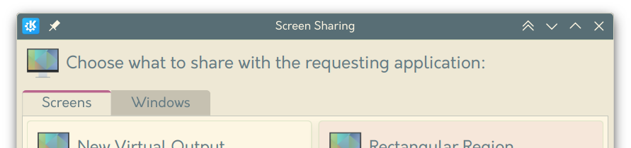
Sadly KDE is also trying out the “modern” style tabs in some places too: